The Artist’s Eye: How to Perceive and Interpret Colour to Boost Your Creativity
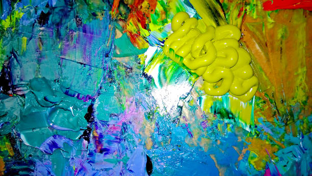
Walk into any museum and you will notice that artists do not simply see colour; they dismantle it, rebuild it, and treat it as a living material. Where most of us glance at a blue sky and file it away as a background fact, a painter notices the way that blue warps near the horizon into a greenish turpentine stain, and how a cloud’s shadow is not grey but a bruised violet laced with leftover orange. This shift in perception is not a gift of genetics but a practised habit of attention. Understanding how artists perceive and interpret colour gives every creative professional a direct method for shaking up stale thinking and seeing the familiar world as a source of raw invention.
The first distinction is that artists perceive colour as an event rather than a label. When a child learns to name a banana “yellow,” a useful shorthand is born, but it also flattens reality. An artist, on the other hand, looks at that same banana under a desk lamp and sees a highlight the colour of pale butter, a midtone that is almost olive, and a shadow that borrows purple from the wooden table beneath it. This kind of seeing is built by deliberately ignoring what the brain thinks it knows and paying attention to what the eye actually receives. A classic training exercise is to paint a white egg on a white cloth. Beginners quickly discover that the egg and the cloth are never the same white. The egg might glow with a cool, blue-white rim, while the cloth dips into warm cream. This perceptual skill—the ability to read local colour, reflected colour, and the colour of light itself—is what allows an artist to make a flat canvas feel like a believable space. For anyone trying to boost creativity, the takeaway is simple: spend five minutes a day isolating a single colour in a real-world scene and naming its shifting identities without using the obvious word. A brick is not red; it is dried cayenne in sunlight, wine stain in the crack, and dusty salmon where the mortar meets it. Over time, the habit rewires your ability to detect nuance, and nuance is the raw fuel of original ideas.
Artists also perceive colour through relationship, not isolation. The exact same grey square will look icy cold surrounded by a hot orange and surprisingly warm when enclosed by a deep teal. Josef Albers spent decades proving that colour is almost entirely governed by this simultaneous contrast, and his lessons now influence everything from cinema colour grading to user interface design. A creative person who understands this stops chasing “perfect” individual colours and starts composing with pairs and trios. When a palette feels dead, the solution is rarely to replace one colour with a louder version; it is to change what sits next to it. Simply placing a muted ochre against an unexpected lavender can create a vibration that feels completely new. This relational way of seeing trains you to think in terms of systems rather than isolated elements—a transferable skill whether you are designing a logo, writing a scene, or structuring a business pitch.
Once the raw perception is in place, interpretation takes over, and this is where colour becomes a deliberate language. Artists interpret colour to shape mood, guide the viewer’s gaze, and tell a story without words. Van Gogh’s The Night Café uses a deliberate clash of blood-red walls and a bilious green ceiling to suggest, in his own words, “the terrible passions of humanity”—an emotional temperature achieved entirely through chromatic decisions. Picasso’s Blue Period did not happen because he suddenly saw the world in blue; he chose a restricted, chilly palette to hold the weight of grief and poverty he wanted to communicate. Even when artists use colour naturalistically, they are editing. Plein air painters know that nature almost never gives you a ready-made composition of values and temperatures. They push the warmth of the sunlit grass, cool the distant mountain to push it back in space, and deliberately mute the sky so a figure’s face becomes the brightest note. This interpretive act is the difference between documentation and art. For the creative mind, it suggests a powerful exercise: before starting any project, define a colour constraint that serves the emotional goal. Ask yourself what the work should feel like, then build a palette limited to three to five colours that embody that sensation. Limitation forces inventiveness far better than unlimited choice ever does.
Interpretation also draws on cultural and personal memory, but in a surprisingly practical way. Every colour carries associations that artists can either exploit or subvert. The rich ultramarine blue that dominated medieval manuscripts was made from ground lapis lazuli, more valuable than gold, and its very expense directed it towards the Virgin Mary’s robe, cementing blue’s link to purity and divinity. A contemporary director might dress a character in that same blue to borrow the centuries-old weight of that association without a single word of explanation. On a personal level, an artist might return again and again to a specific mustard yellow because it dredges up the light of a childhood kitchen. These memory triggers are not vague moods; they are precise reference points that make creative work feel authentic. Keeping a simple colour diary—swatches torn from magazines, a photograph of a rusted gate that caught your eye, a note about the exact shade of a café’s wall—builds a personal vocabulary that you can later draw on when a project demands an emotional truth but you find yourself staring at a blank screen.
Finally, artists learn to perceive the colour of light itself, which is perhaps the most generative habit a creative person can adopt. Light has temperature and tint, and it transforms every surface it touches. The same white house looks completely different at dawn, noon, and under streetlamps. Monet’s haystack series is the ultimate proof, but you do not need a field in Giverny to practise. Simply observe how the colour of your own workspace shifts throughout the day and, crucially, notice how those shifts change the feeling of the room. Then use that awareness. If you want a photograph to feel like a lazy summer afternoon, you search for the golden, elongated light of late-day sun, dial up the warmth in your white balance, or add a whisper of peach to the highlights in post-production. If a scene in a story needs to feel liminal and strange, you describe the sickly green of a fluorescent-lit hallway at three in the morning. This is applied colour perception, and it moves beautifully between physical and digital tools.
Embracing the artist’s way of perceiving and interpreting colour is less about learning rules than about exercising a muscle. You practise seeing what is actually there instead of what you expect. You make a note of the emotional ping a colour combination gives you. You limit your options so you are forced to be resourceful. And you begin to treat colour not as decoration but as a structural element of your thinking. The result is a creative practice that feels perpetually restless, curious, and alive to the world’s visual noise—a world that, it turns out, is far stranger and more richly coloured than our mental shortcuts ever allowed.